Four annotations do almost everything
- Arrow — *this specific thing*. One per idea. If you need three arrows, you probably need three screenshots or numbered steps.
- Rectangle — *this region*. Better than an arrow when the thing has area: a table column, a sidebar, a form section.
- Numbered step marker — *do these in this order*. The single most useful annotation for documentation, and the one people most often fake by hand.
- Blur or a solid block — *this is none of your business*. See how to blur sensitive information.
Text labels and freehand pen are worth having, but reach for them last. Text competes with the UI text already in the screenshot; freehand looks casual, which is fine in a chat and wrong in a manual.
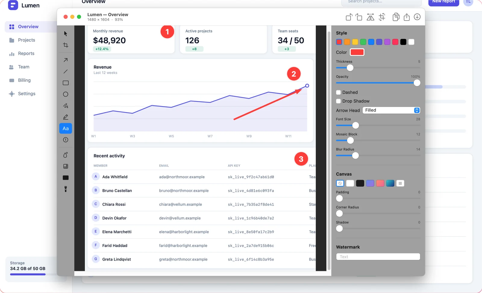
Placement rules that make markup readable
- Come in from the nearest edge. An arrow that crosses the middle of the screenshot hides the thing it is explaining.
- Never cover the subject. Put the marker beside the button, not on it. The reader has to recognise the button in their own app.
- Use one accent colour. A screenshot with red, blue, green and yellow markup reads as noise. Pick one colour that does not already appear in the UI.
- Keep stroke weight consistent. Mixed line weights look accidental. Set it once and leave it.
- Number in the reader's order. If step 1 is at the bottom right and step 2 at the top left, that is still 1 then 2. Screen position is not the sequence.
When you find yourself wanting five arrows, that is the signal to split into two screenshots. Readers follow two simple images far more reliably than one busy one.
Keep it editable
Most annotation ends up burned into the pixels the moment you save. Then the button moves in the next release, or you put the arrow one step too early, and the only fix is to recapture and redo the whole thing.
Shotcake keeps every annotation as an object. Reopen the capture from the library weeks later and each arrow, label, step marker and blur region is still selectable, movable and deletable. Crop, rotate and flip are non-destructive too, so a wrong crop is one undo rather than a recapture.
A note on step markers
Numbered markers auto-increment as you place them, which sounds trivial until you have renumbered a nine-step walkthrough by hand after inserting a step in the middle. If your tool does not auto-number, that renumbering is the hidden cost of every documentation edit you will ever make.