Why raw captures look wrong
A screenshot is a rectangle of someone else's interface with hard edges. Dropped straight onto a white page it merges with the page; dropped onto a slide it looks pasted. The fix is not decoration — it is giving the image its own boundary so the eye can tell where the content stops.
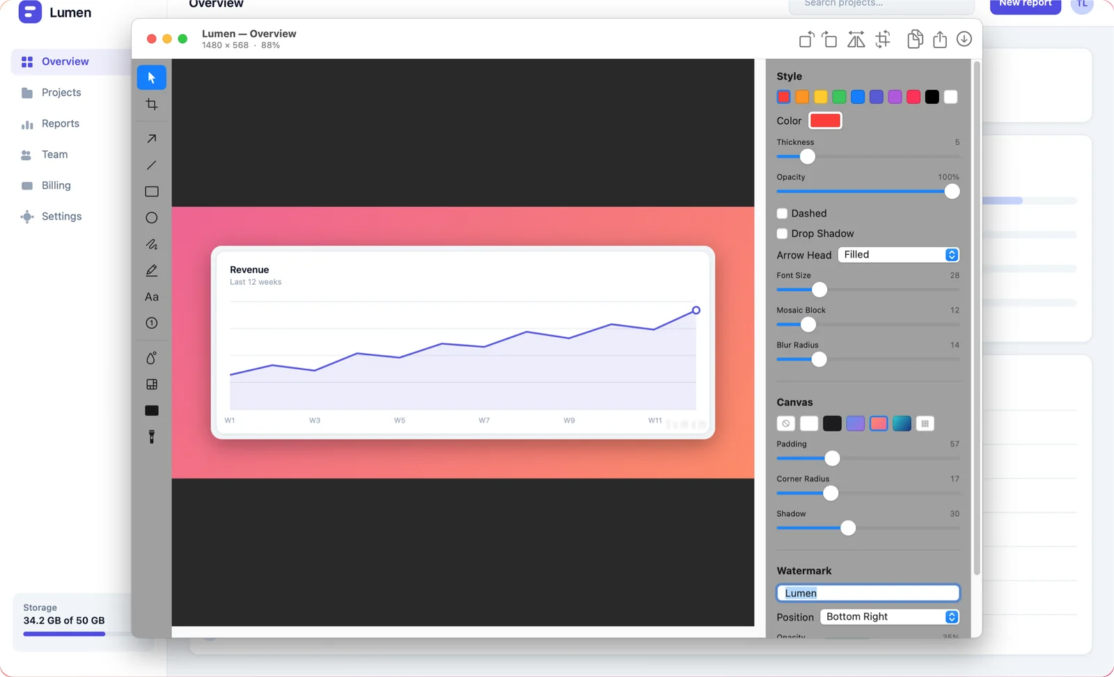
The four adjustments, in order of impact
- Padding. The biggest single improvement, and the one people skip. Somewhere between 4% and 8% of the image width on every side.
- A backdrop. A solid colour is enough. A soft gradient reads as more considered without drawing attention to itself. Keep it away from your brand's loudest colour — the screenshot is the subject.
- Rounded corners. Match roughly what macOS uses on windows. Enough to soften, not enough to look like a sticker.
- A drop shadow. Soft, large, low opacity. A tight dark shadow looks like a 2008 web page.
Do all four at 50% of what feels right. Screenshot decoration is a place where restraint reads as competence and enthusiasm reads as clip art.
Export scale, and why your images look blurry
On a Retina display a capture of a 600-point-wide window is 1200 pixels. Export it at 1x and you get 600 pixels — which then gets displayed at 600 points on the reader's Retina screen and looks soft. Export at 2x and it stays crisp.
- Documentation and web pages — export at 2x, then let the page display it at half size. This is why the images on this site are 1600 pixels wide in a roughly 800-pixel column.
- Slides — 2x as well; projectors and shared screens are unforgiving.
- Chat and issue trackers — 1x is fine and keeps the upload small.
Format matters less than scale, but as a rule: PNG for anything with text or UI, JPEG only for photographic content, PDF when the recipient will print it.
Watermarks
Useful for screenshots that will circulate outside your control — a support template, a tutorial that gets reposted. Keep them small, low-opacity and in a corner. A watermark across the middle of a screenshot destroys the thing it is protecting.
Doing it without a design tool
Shotcake has all of this in the editor that opens on the capture: padding, solid and gradient backdrops, corner radius, shadow and watermark with position, size and opacity control. Export at 0.5x, 1x or 2x as PNG, JPEG, HEIC, TIFF or PDF, with a filename template so the exports are consistent.